
Colors
Read more about color—from light and perception to RGB, CMYK, HSL, hex, the color wheel, gradients, and contrast you can try in PictorX.

Light, eyes, and two kinds of mixing
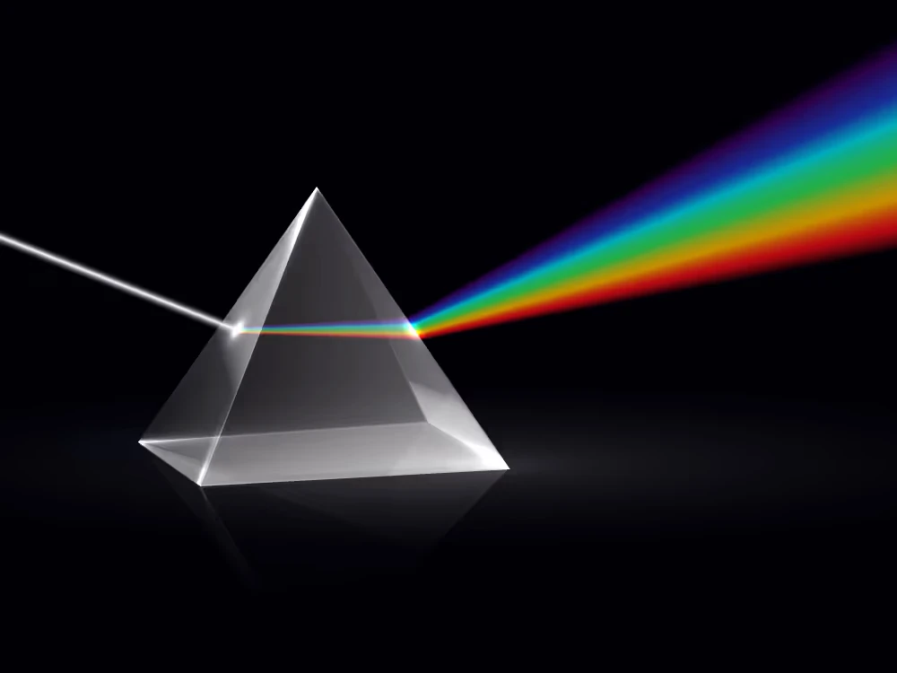
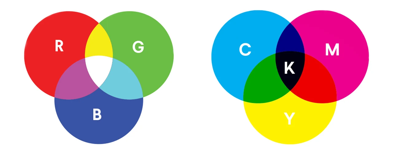
Color is not a coating sitting on an object. It is light, plus a brain that turns wavelengths into red, yellow, or blue-green. Screens add light (additive mixing): red, green, and blue lamps combine toward white. Print and paint subtract light (subtractive mixing): inks filter wavelengths, and mixing them heads toward black. That is why a neon on a monitor rarely matches the same job on paper.
RGB: how screens count color
A pixel on a phone or laptop is three tiny lights. Each channel is usually stored as 0–255 (eight bits). (0, 0, 0) is black, (255, 255, 255) is white, (255, 0, 0) is full red. Hex is the same triple written for the web: #FF0000 is that red, #000000 is black. Designers still talk in RGB because that is what the display actually emits.
CMYK: why the printout looks different
Printers lay cyan, magenta, yellow, and black (K) inks. They cannot emit light, only soak it up, so the RGB gamut of a screen is larger than most CMYK presses. A saturated electric blue on a monitor often dulls on paper. Convert to CMYK before you promise a print color, and proof on the stock you will use. PictorX can show CMYK numbers from a picked color so you see the gap; it is not a substitute for a press profile.
HSL and HSV: the designer’s knobs
Hue is the position on the rainbow (0–360°). Saturation is how pure versus gray. Lightness (HSL) is how close to white or black; value/brightness (HSV) is how close to black while keeping the hue vivid until the end. Designers like HSL and HSV because “a bit darker, same orange” is one slider, not a guess among three RGB numbers.
Hex and named CSS colors
Hex (#RRGGBB, sometimes #RGB or #RRGGBBAA) is the web’s shorthand for RGB. CSS also ships named colors—coral, steelblue, rebeccapurple—that map to fixed hex values. Names are handy for sketches; hex (or a modern CSS color function) is what you ship when the brand has to match.
The color wheel and relationships
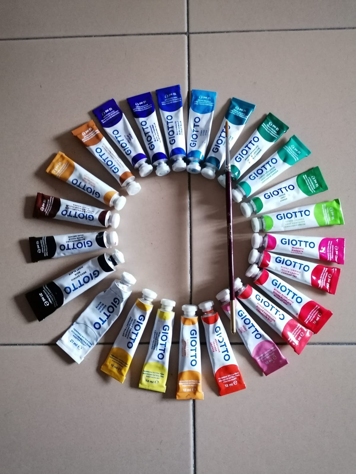
A color wheel arranges hues in a circle. Classic relationships: complementary colors sit opposite (blue and orange) and contrast hard; analogous colors are neighbors and feel related; triadic colors sit three even steps apart and stay lively; split-complementary takes a hue plus the two beside its opposite, which is contrast with less clash; monochromatic is one hue at many lightnesses. PictorX’s palette generator currently keeps complementary, analogous, and monochromatic. The wheel still explains the rest of the classic set even when a given tool does not offer every harmony.
Gradients: paths between colors
A gradient is a blend along a path. Linear travels in a direction; radial grows from a center. Color stops pin exact colors at positions along that path. More stops mean more control, not automatically more taste. In CSS, linear-gradient and radial-gradient are the same idea. PictorX’s gradient editor lets you drag stops and copy CSS, HEX, RGB, HSL, HSV, or CMYK.

Contrast, accessibility, warm and cool
Contrast is how far two colors sit in lightness (and hue). WCAG asks for enough contrast so text stays readable: about 4.5:1 for normal text and 3:1 for large text at level AA. That is a floor, not a style. Warm hues (reds, oranges, yellows) feel closer; cool hues (blues, greens, violets) recede. Use contrast for type and UI; use warm and cool for mood.
Color tools in PictorX
The color wheel is for picking a hue and reading harmonies. The gradient editor is for blends and CSS. The palette generator builds, locks, and shuffles sets—and can pull colors from a photo. Color transfer restyles one picture with the palette of another, in the browser. Color effects push a photo into tints and other looks. None of this replaces a press or a spectrophotometer; it is a fast way to see how color behaves on a picture.
Frequently asked questions
What is the difference between RGB and CMYK?
RGB is additive light on screens (usually 0–255 per channel). CMYK is subtractive ink on paper. They cover different ranges, so a screen color often cannot print exactly.
What does complementary mean on a color wheel?
Complements sit opposite each other. Together they contrast strongly. PictorX’s palette generator can build a complementary set from a starting color.
Why do designers use HSL instead of RGB?
Hue, saturation, and lightness match how we talk about color. You can darken an orange in HSL without accidentally mixing it brown the way a naive RGB tweak might.
How much contrast does WCAG require?
For AA, about 4.5:1 for normal text and 3:1 for large text. Check the type on its real background, not a sample swatch alone.
Related tools
Color wheel
Pick a color on an interactive wheel, generate complementary, analogous, triadic, and other palettes, and copy HEX, RGB, HSL, HSV, or CMYK.
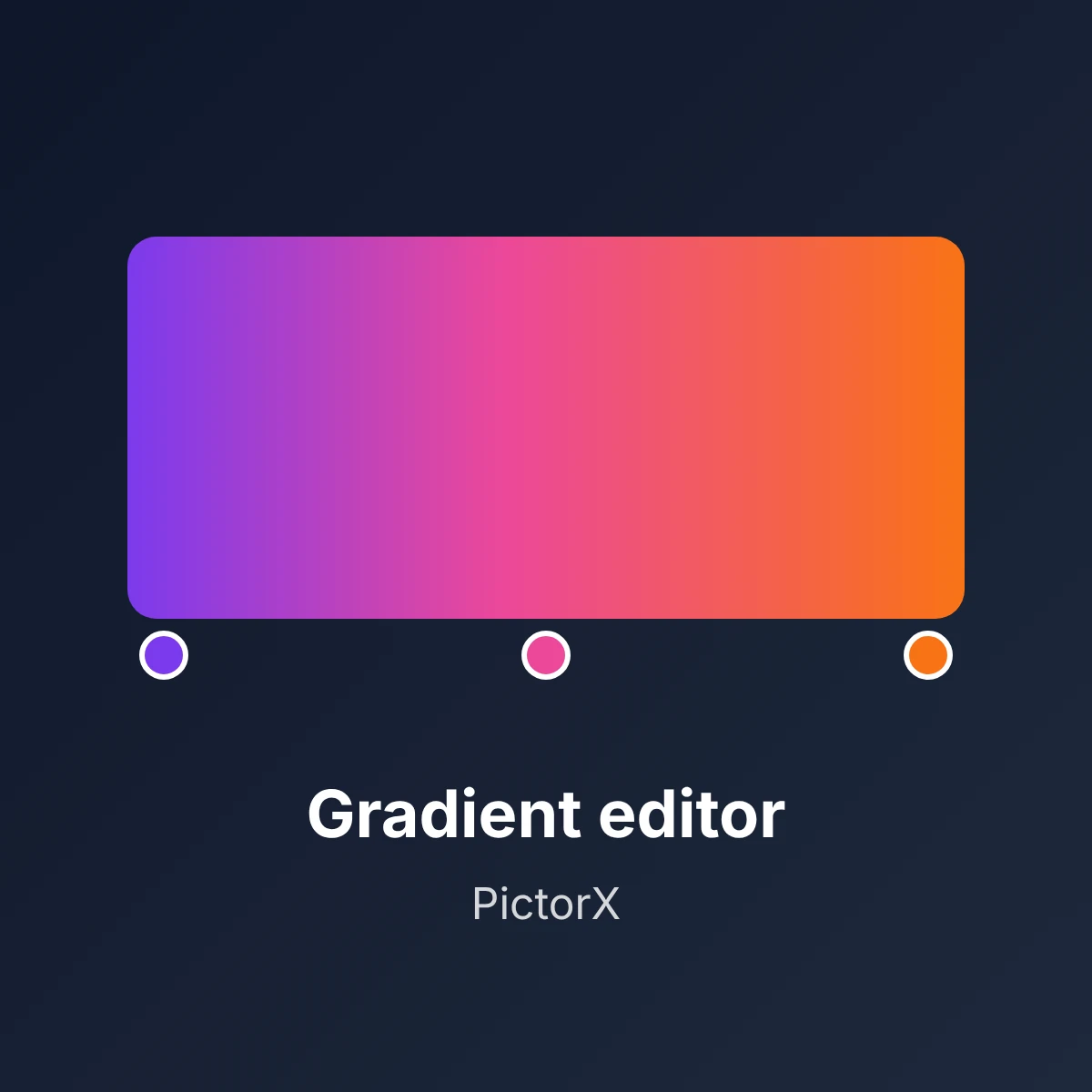
Gradient editor
Build linear and radial CSS gradients in your browser. Drag color stops, set the angle, and copy CSS, HEX, RGB, HSL, HSV, or CMYK.
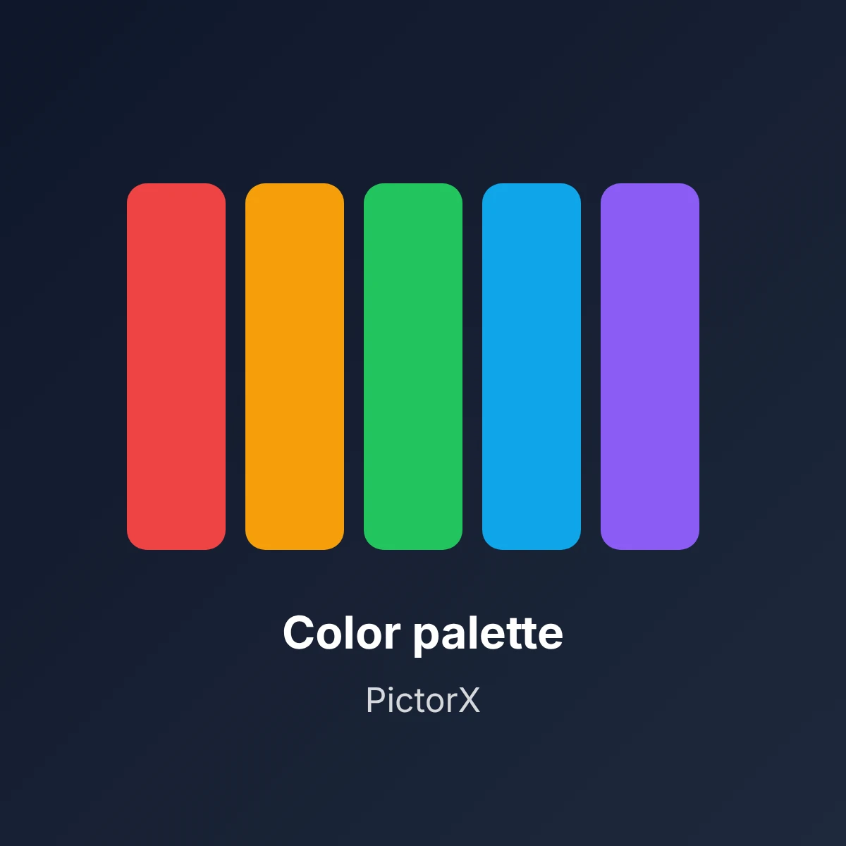
Color palette generator
Build, lock, and shuffle color palettes in your browser. Copy HEX, CSS variables, or JSON, export PNG or SVG, and extract colors from a photo.
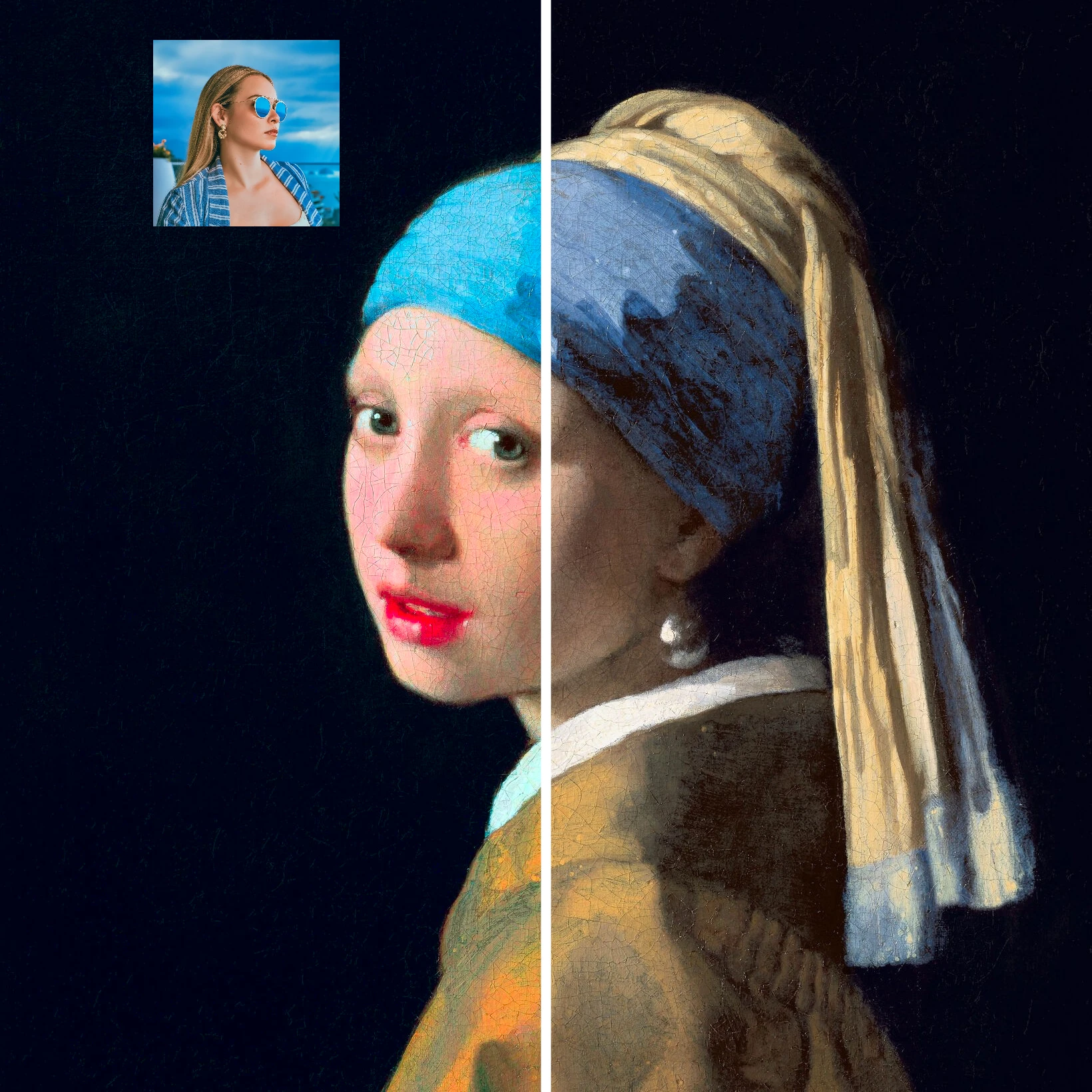
Color transfer
Recolor a photo using the colors of a second image. Live preview in your browser with a strength slider and optional preserved brightness.

Color effects
Recolor a photo from Effects → Color with neon edges, heat maps, and two- or three-color palettes.
Ready to try it?
Open PictorX in your browser — no install, no credit card required to start.
Try the color wheel