
The story behind the color contrast checker
Low contrast is one of the most common accessibility problems on the web. The rules for it look like magic numbers, but each one has a reason, rooted in how eyes lose sensitivity with age and how screens produce light.
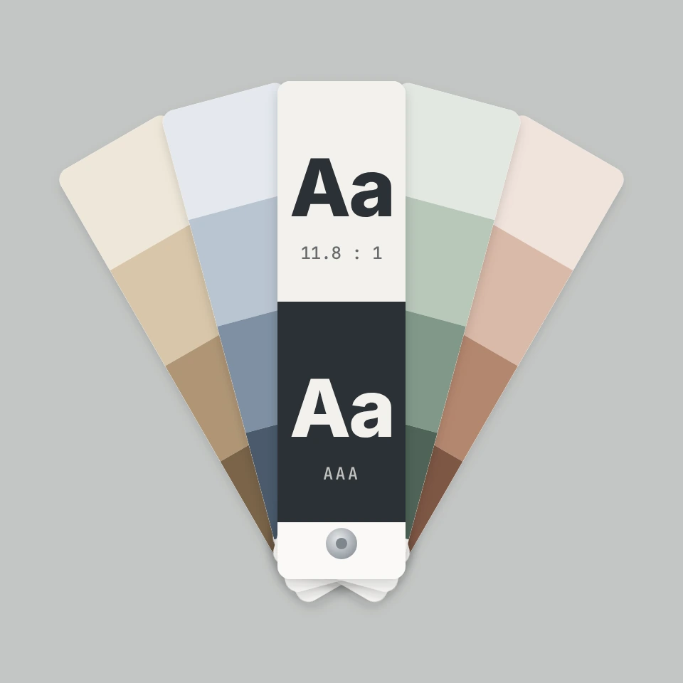
Where 4.5 and 7 come from
WCAG 2.0 became a W3C Recommendation in December 2008. Its authors started from a 3:1 minimum found in the ISO 9241-3 standard and raised it to make up for the contrast sensitivity lost by people with vision of about 20/40, which is common around the age of 80. That gave 4.5:1 for level AA. Level AAA, 7:1, does the same for vision of about 20/80.
Relative luminance
The formula first turns each sRGB channel back into linear light, then weights red, green and blue by 0.2126, 0.7152 and 0.0722, the same weights used by the ITU-R BT.709 television standard, because the eye is most sensitive to green. The ratio is the lighter luminance plus 0.05 divided by the darker plus 0.05. The 0.05 stands for light reflected from the screen, and it limits the scale to the range from 1:1 to 21:1, black on white.
Beyond text
Large text, at least 24 px or 18.66 px when bold, stays readable at lower contrast, so it needs only 3:1 for AA. WCAG 2.1, published in June 2018, added success criterion 1.4.11 Non text Contrast: borders of inputs, focus rings, icons and the parts of a chart needed to understand it must reach 3:1 against what is next to them.
Color blindness and what comes next
About 1 in 12 men and 1 in 200 women have a color vision deficiency, mostly in red and green. Contrast is measured on luminance, so a passing pair stays readable, but colors that differ only in hue can look alike. The simulation here uses the model by Machado, Oliveira and Fernandes from 2009. Drafts of WCAG 3 explore APCA, a newer method that also considers font size and whether text is dark on light or light on dark.
Frequently asked questions
Is good contrast enough for accessibility?
No. It is one requirement among many. WCAG also asks that color is not the only way to show meaning, for example by adding an icon or underline to a link or an error.
Does the simulation show exactly what a person sees?
It is a close approximation of full dichromacy. Many people have a milder form, and every person sees a little differently, so treat it as a guide.
Should I use APCA instead of the WCAG 2 ratio?
For conformance today, use the WCAG 2 ratio. WCAG 2.2, published in October 2023, keeps the same formula, and laws and standards such as EN 301 549 refer to it. APCA is still in development.
Related tools
Color contrast checker
A free WCAG color contrast checker: enter text and background colors as HEX, RGB or HSL, see the contrast ratio with AA and AAA results, get the nearest passing color and simulate color blindness.
Color palette generator
Build, lock, and shuffle color palettes in your browser. Copy HEX, CSS variables, or JSON, export PNG or SVG, and extract colors from a photo.
Color wheel
Pick a color on an interactive wheel, generate complementary, analogous, triadic, and other palettes, and copy HEX, RGB, HSL, HSV, or CMYK.
Gradient editor
Build linear and radial CSS gradients in your browser. Drag color stops, set the angle, and copy CSS, HEX, RGB, HSL, HSV, or CMYK.

Colors
How color works on screens and in print: RGB, CMYK, HSL, hex, the color wheel, gradients, contrast, and PictorX tools.
Ready to try it?
Open PictorX in your browser — no install, no credit card required to start.
Open the color contrast checker