
Black and white
Read more about black-and-white and bilevel images—threshold cutoffs, Bayer ordered dithering, Floyd–Steinberg error diffusion, and print-style screens you can try in PictorX.
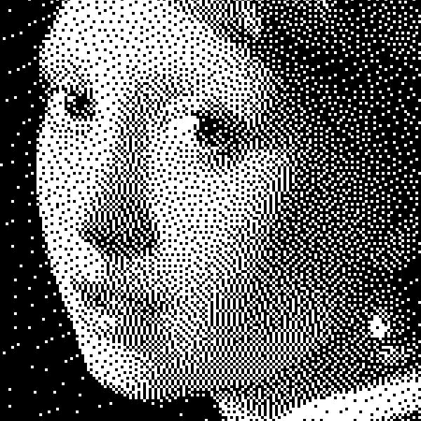
Black & white is not always bilevel
A grayscale photo still has hundreds of gray steps between black and white. A bilevel (two-tone) image keeps only two colors—usually ink and paper. Newspapers, laser etch, stamps, and many screen-print looks are bilevel. PictorX’s Black and White effects flatten a photo into two colors (or a dithered mix of those two) instead of a soft gray ramp. That is different from a simple Grayscale slider in Adjust or Color, which preserves midtones.
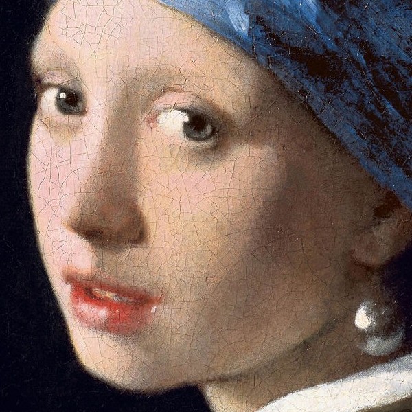
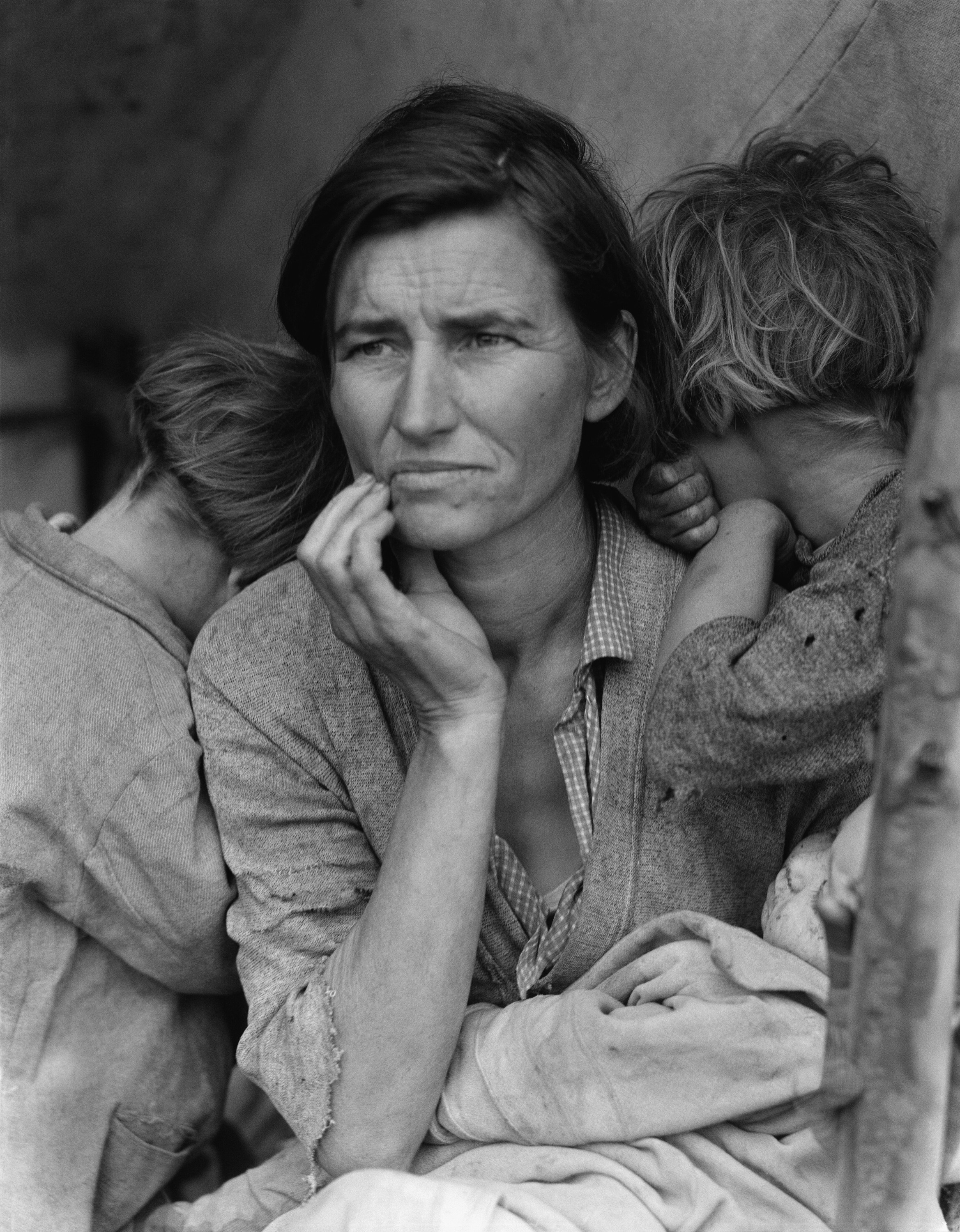
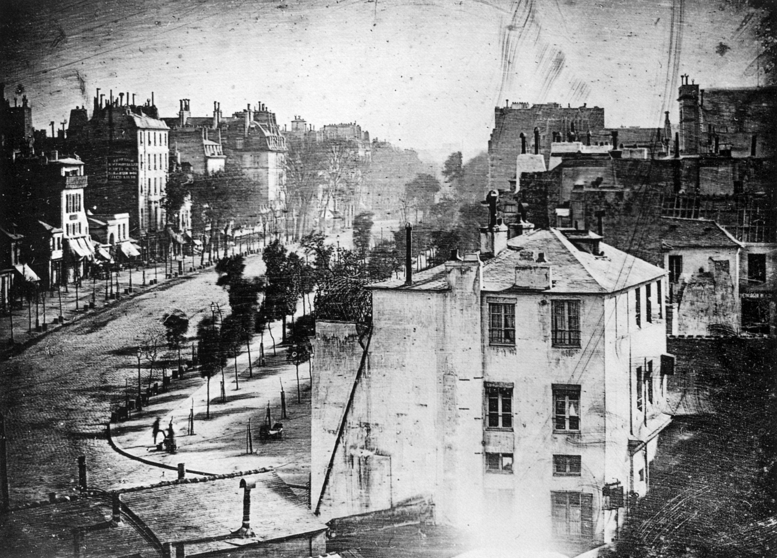
Threshold: a hard cutoff
Threshold compares each pixel’s brightness to a number. Darker than the cutoff becomes the foreground color; lighter becomes the background. Softness can feather that edge so the jump is less brick-wall. Raise the threshold to keep more of the photo white (or your background color); lower it to flood the frame with ink. Threshold is bold graphic design: logos, stamps, high-contrast portraits. It does not invent midtones—detail in flat areas disappears into solid black or white.
Ordered dithering: Bayer patterns
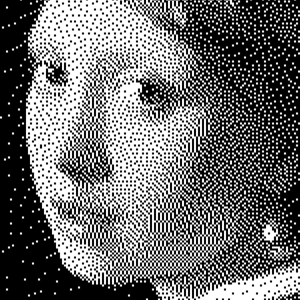
Ordered dithering does not smear error across neighbors. It tiles a small threshold matrix—classically a Bayer matrix—over the image. Each pixel’s gray is compared to the matrix entry at that spot; that decides black or white. The repeating pattern of dots or cells suggests midtones from a distance while staying purely bilevel up close. Cell size controls how coarse the screen feels. The look is geometric and printable: comic screens, early computer graphics, laser-etched plaques.
Error diffusion: Floyd–Steinberg and friends
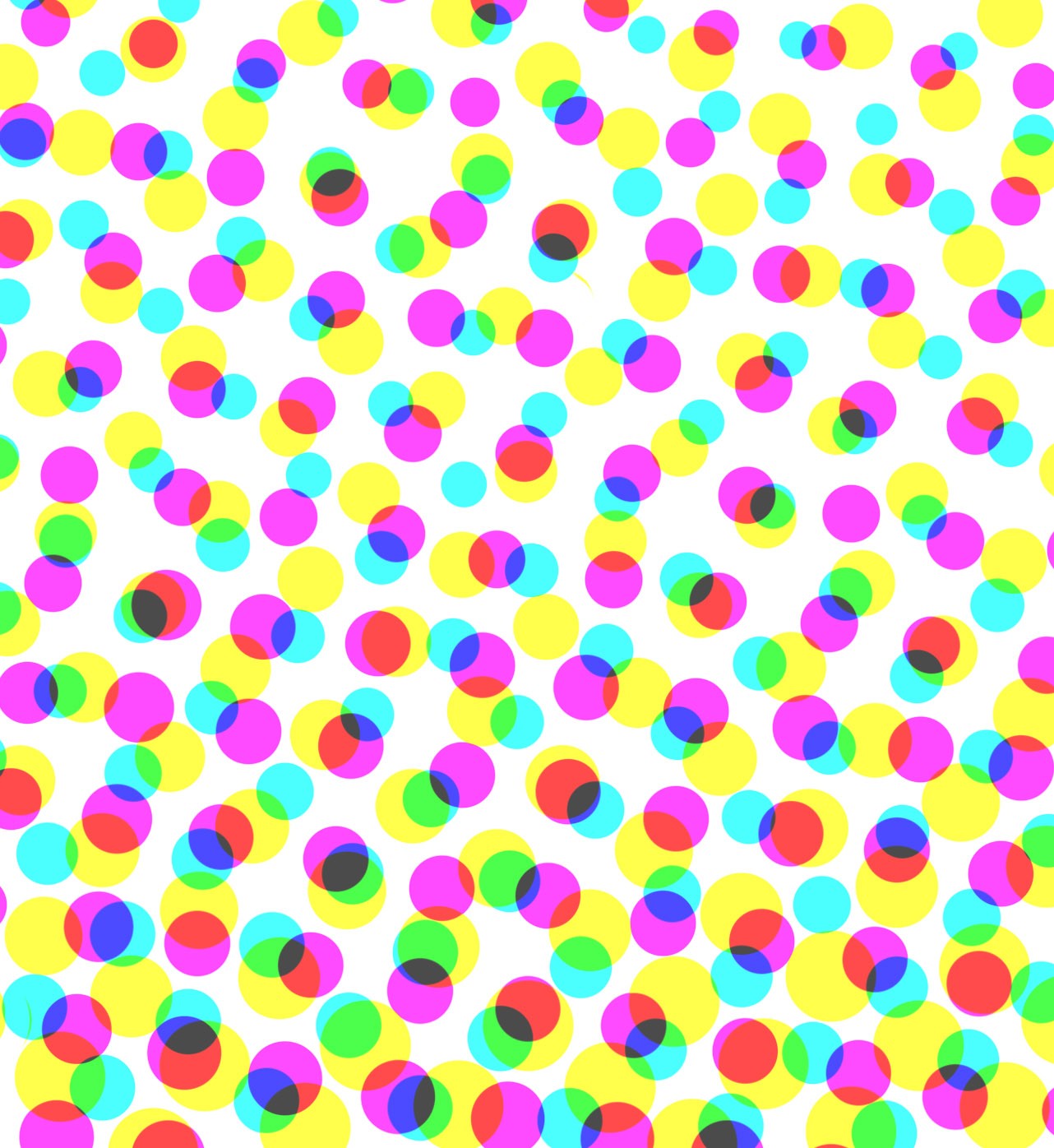
Error diffusion quantizes a pixel, then pushes the leftover brightness error into neighbors that have not been visited yet—usually right, below-left, below, and below-right in Floyd–Steinberg’s classic weights. Burkes and Stucki use wider neighborhoods for slightly smoother grain. The result looks more organic than Bayer tiles: midtones become a buzzing field of ink dots without a rigid grid. Cell size still controls scale. Choose error diffusion when you want photographic tone without a wallpaper pattern; choose ordered dithering when you want a deliberate screen.
Dots, squares, and mezzotint
Besides threshold and dither, PictorX offers print-style screens. Dots and Squares sample the photo through a rotated cell grid—like a newspaper halftone—then paint solid cells in your foreground and background colors. Angle and cell size change how coarse and directional the screen feels. Mezzotint sprinkles grainy speckles at Fine, Medium, or Coarse settings for an etched-plate texture. Pair custom foreground/background colors (not only black and white) for two-tone brand looks.
When to use which
Need a full gray ramp? Start with Grayscale. Need a logo stamp or poster cutout? Threshold. Want a comic or early-computer screen with visible tiles? Ordered dithering. Prefer a photographic gray field without a wallpaper grid? Error diffusion (Floyd–Steinberg, Burkes, or Stucki). Want newspaper dots or square screens you can rotate? Dots or Squares. Want etched speckles? Mezzotint. Soft film grayscale also lives on Vintage.
Photo-editing tips
Start from a well-exposed source: crushed shadows and blown highlights leave little for a threshold or dither to work with. For portraits, raise softness slightly on Threshold so skin edges do not turn into jagged masks. Zoom to 100% when judging cell size—on-screen midtones can hide a screen that looks coarse in print. Try dark ink on light paper first, then invert colors for chalk-on-blackboard looks. Keep an original layer; bilevel commits hard.
Try it in PictorX
Open Black and White effects to switch among Grayscale, Threshold, Dots, Squares, Ordered Dithering, Error Diffusion, and Mezzotint on a sample or your own photo. Tune strength, threshold, cell size, angle, grain, and foreground/background colors in the browser. Related tools: Adjust (Threshold and Grayscale), Color effects (halftone-style looks), Pixelate (color halftone and mosaic screens), and Vintage for soft film grayscale. Keep editing with layers and other filters in the same workspace.
Frequently asked questions
What is the difference between grayscale and threshold?
Grayscale keeps a full range of gray tones. Threshold (and other bilevel looks) flattens the photo into two colors—or a dithered mix of those two—so midtones become pattern, not soft gray.
Ordered dithering vs error diffusion—which looks better?
Neither is universally better. Ordered dithering shows a clear repeating tile—great for graphic screens. Error diffusion looks more organic and photographic. Pick the texture that matches the story.
Which PictorX tools include dither and threshold?
Black and White effects is the dedicated page (Grayscale, Threshold, Dots, Squares, Ordered Dithering, Error Diffusion, Mezzotint). Adjust also exposes Threshold and Grayscale; Pixelate covers color-halftone style screens.
Can I use colors other than black and white?
Yes. Most Black and White presets let you set custom foreground and background colors, so the “ink” and “paper” can be brand navy and cream, neon on black, and more—still only two tones.
Related tools
Black and White effects
Apply grayscale, threshold, dots, squares, ordered dithering, error diffusion, and mezzotint to a photo in your browser. Full gray ramps or two-tone prints with custom foreground and background colors.
Adjust
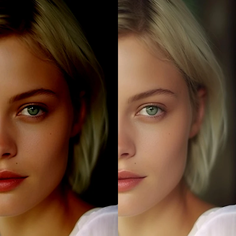
Correct exposure and color from Image → Adjust.
Color effects
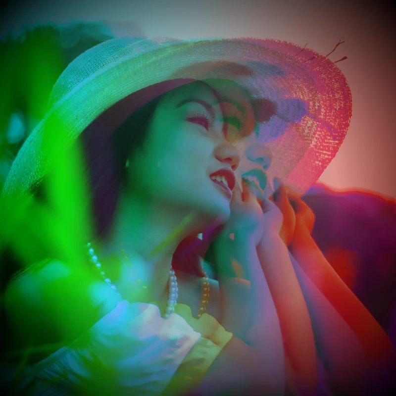
Recolor a photo from Effects → Color with neon edges, heat maps, and two- or three-color palettes.
Pixelate effects
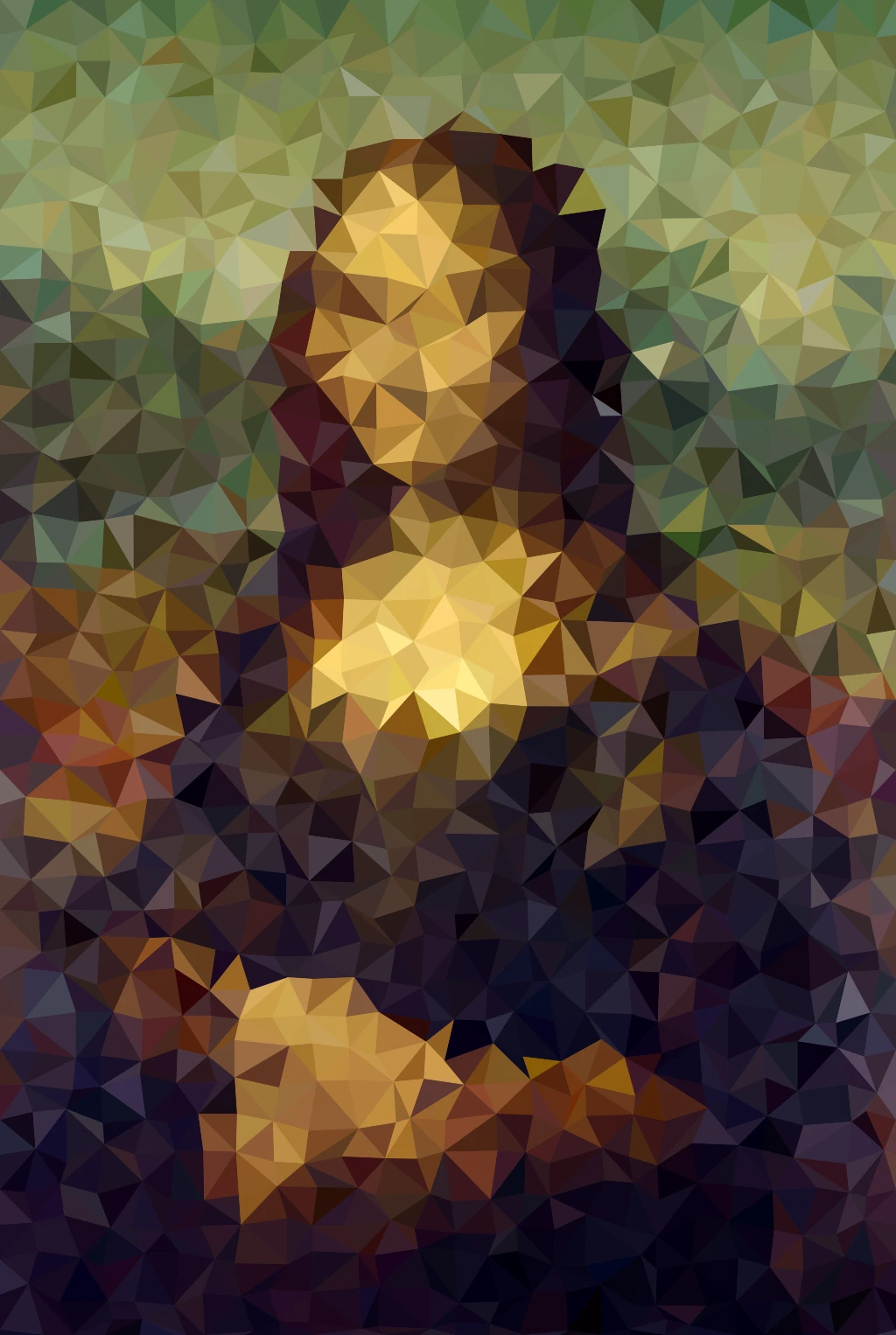
Turn photos into mosaic tiles, hexagons, crystals, low-poly art, halftone dots, and retro arcade palettes.
Ready to try it?
Open PictorX in your browser — no install, no credit card required to start.
Try black and white effects